
This collection showcases work across a variety of industries, highlighting my ability to adapt to different brands, audiences, and creative challenges. Each project includes a brief overview of my design process, offering a glimpse into the strategic thinking behind the final solution.
explore the process
↓
explore the process ↓
Stream Realty
Commercial Real Estate Marketing
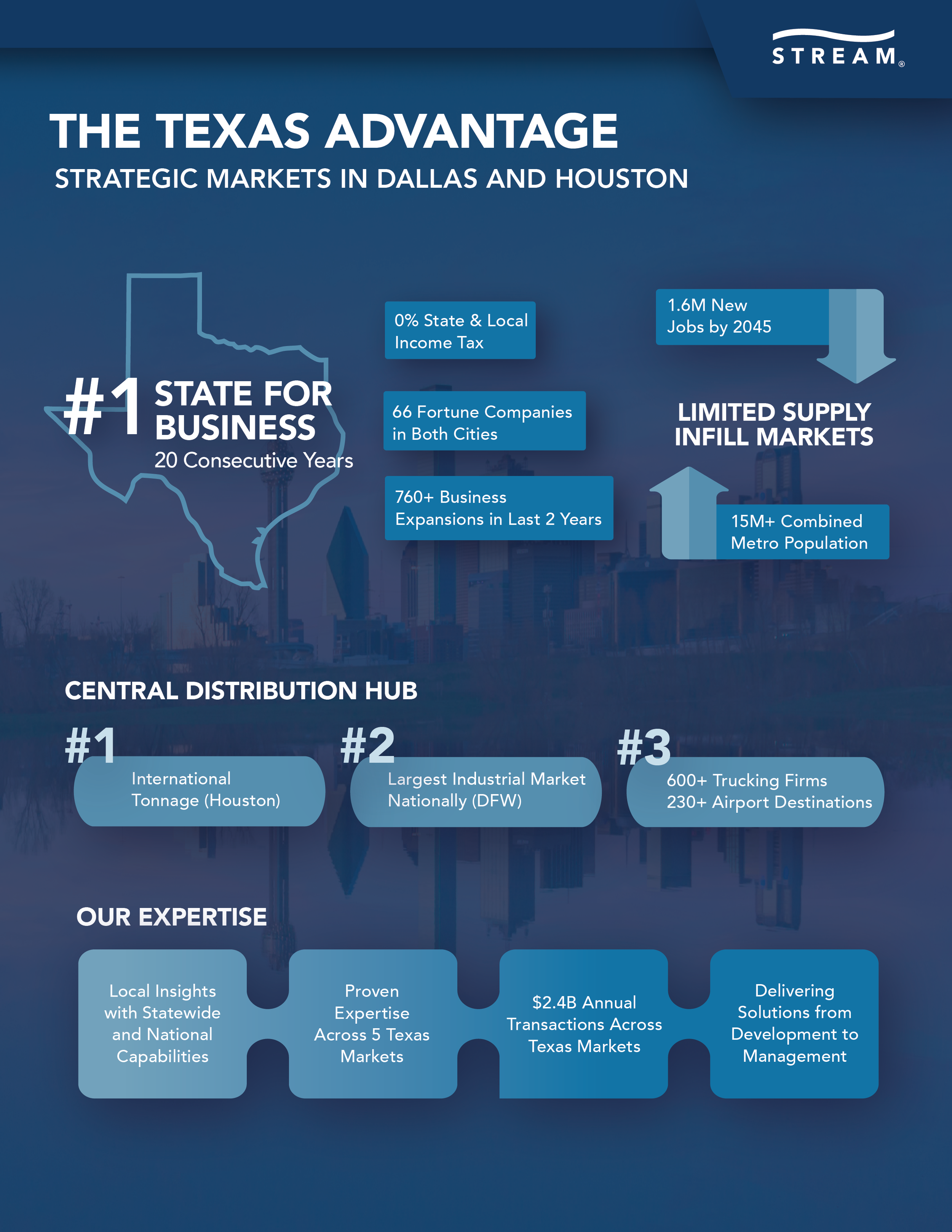
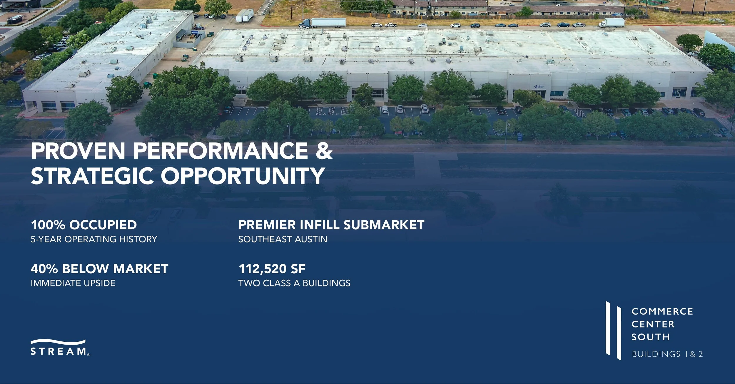
Transforming complex commercial real estate data into clear, engaging marketing materials required balancing information with visual storytelling. Rather than presenting every statistic provided, the focus was on identifying the information prospective investors and tenants would find most valuable when evaluating the opportunity as a whole. The LinkedIn graphic prioritizes the property's key selling points in a clean, easy-to-scan layout, enabling investors to quickly identify the information most relevant to their decision-making, while the accompanying infographic translates extensive Texas market research into a cohesive visual narrative through thoughtful typography, iconography, and information hierarchy. By analyzing and prioritizing dense content, these pieces demonstrate how effective design can transform complex research into accessible marketing materials that communicate confidence, credibility, and value while remaining consistent with Stream Realty’s clean, professional brand identity.
Lotus Pest Control
Marketing Systems & Customer Collateral
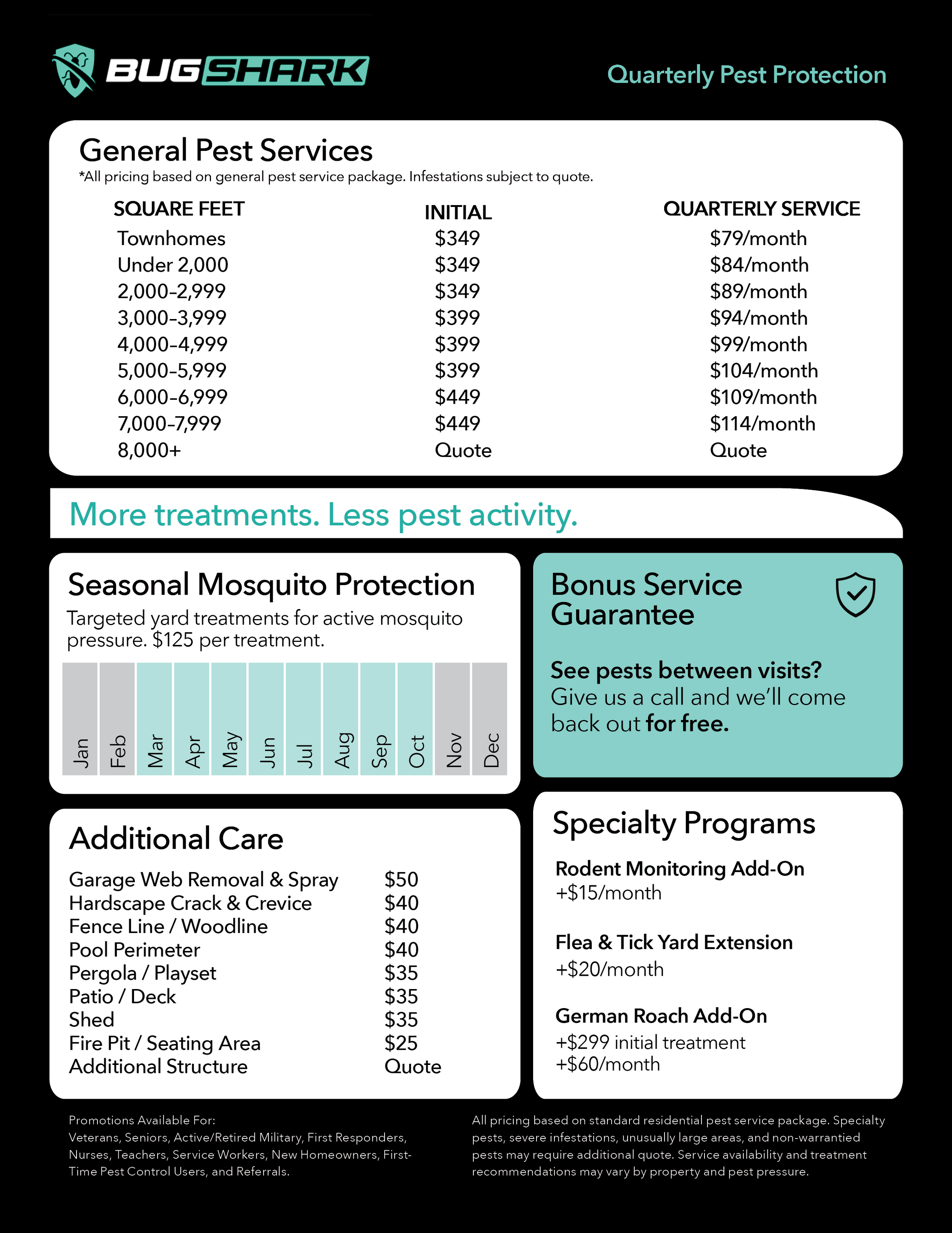
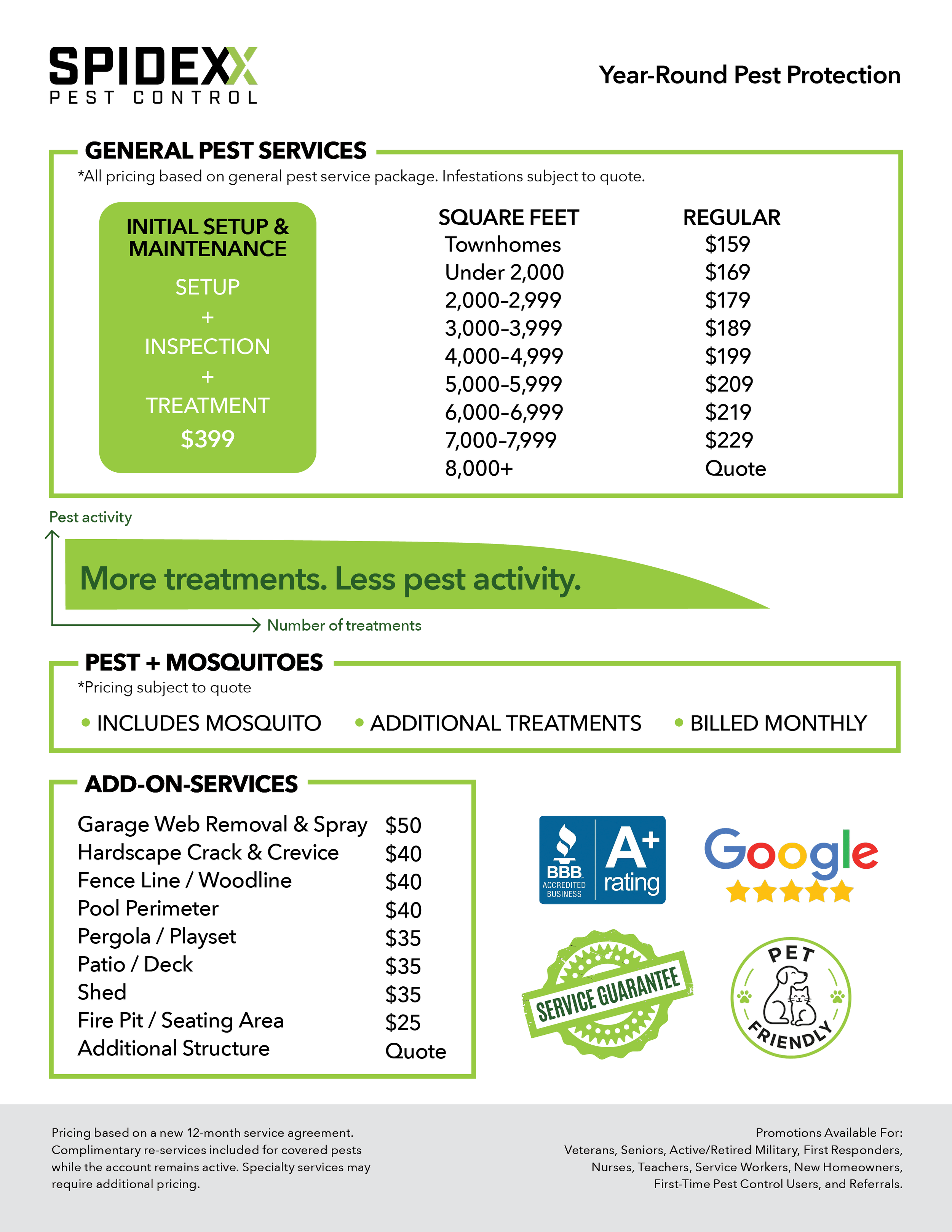
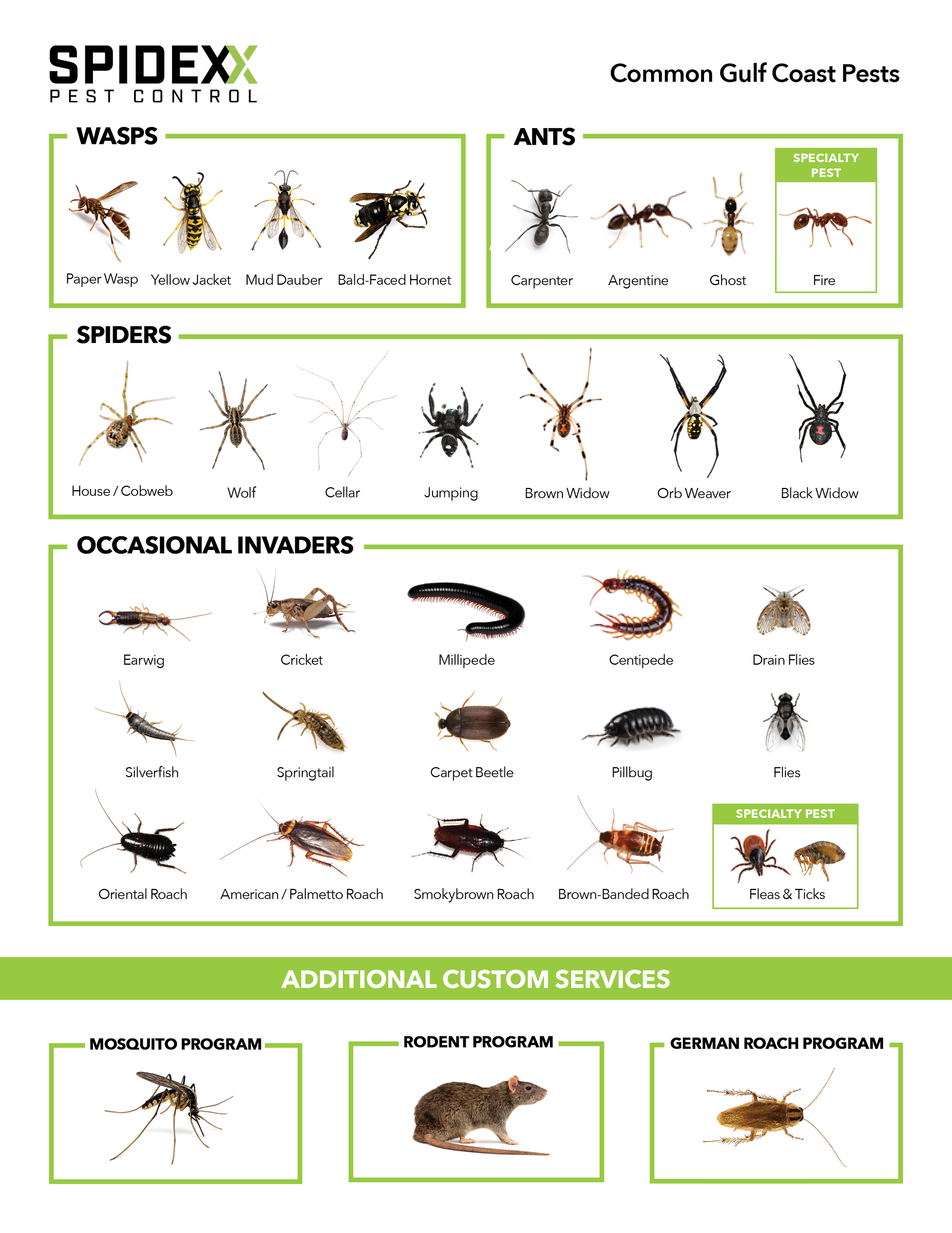
Built around a flexible design framework, this series of customer-facing marketing flyers was created for multiple pest control companies operating under Lotus Pest Control’s marketing network. While each company maintained its own branding, the challenge was creating a flexible design system that could be adapted across brands while communicating services in a clear and consistent way. By customizing a consistent framework through each company’s branding, color palette, imagery, and messaging, I created marketing materials that remained cohesive while reflecting each brand’s identity. Prioritizing information hierarchy and readability allowed detailed service information to be transformed into approachable, easy-to-navigate flyers for homeowners.
Navy Beach Hamptons NY
Instagram Story Campaign
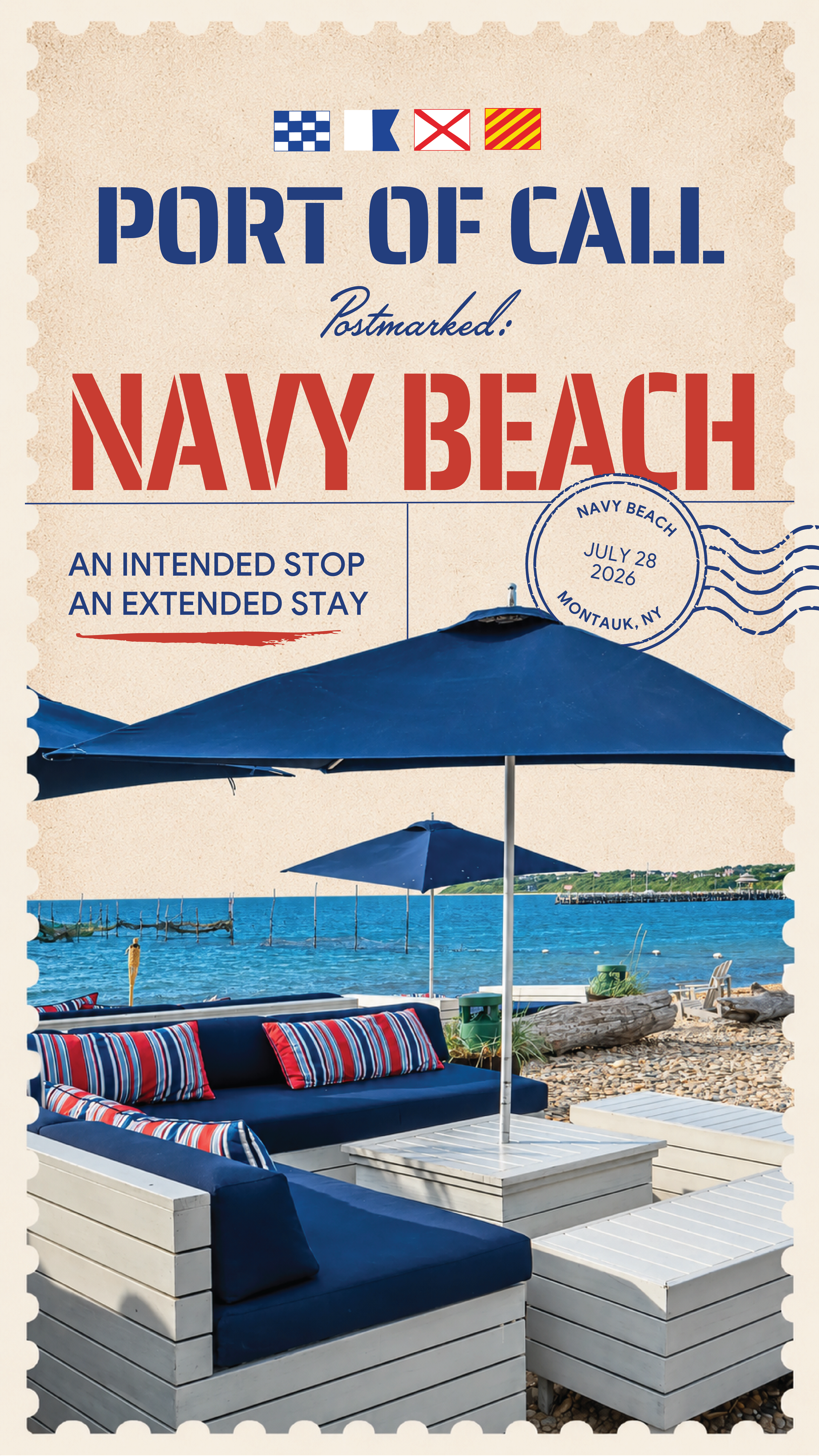
Inspired by the nautical term "Port of Call," a designated stop made during a voyage, this concept positions Navy Beach as more than a waterfront restaurant in Montauk NY, it becomes a destination people discover along their own voyage. The Instagram Story was designed as a digital postcard as if it were sent by someone who visited or discovered Navy Beach during their “port of call”. Through the postcard format, the story becomes both a travel memento and an invitation that can be shared online, allowing viewers to experience Navy Beach through the perspective of someone who has already discovered it. The copy, "An Intended Stop. An Extended Stay." reinforces this narrative by connecting directly to the meaning of a port of call, while also referencing Navy Beach's waterfront setting and its connection to Montauk's boating culture.
Three Ducks Hamptons NY
Instagram Feed Brand Event Announcement
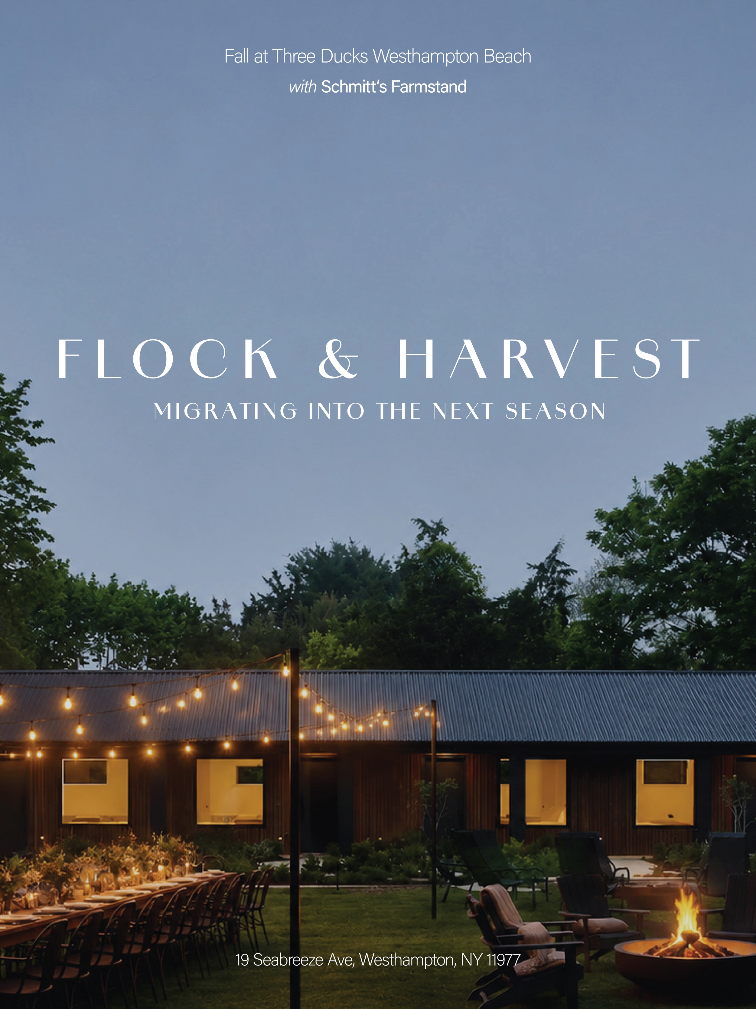
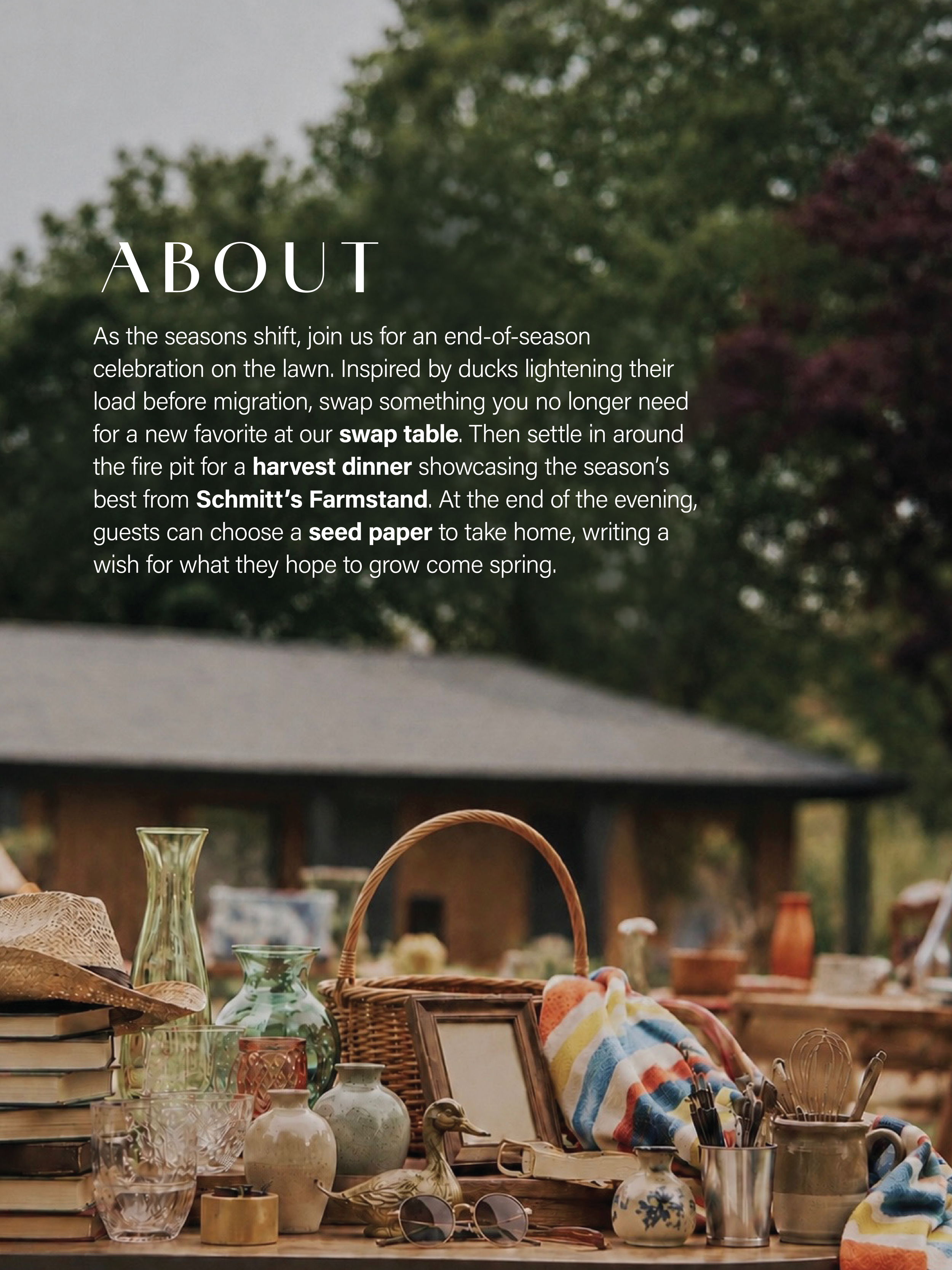
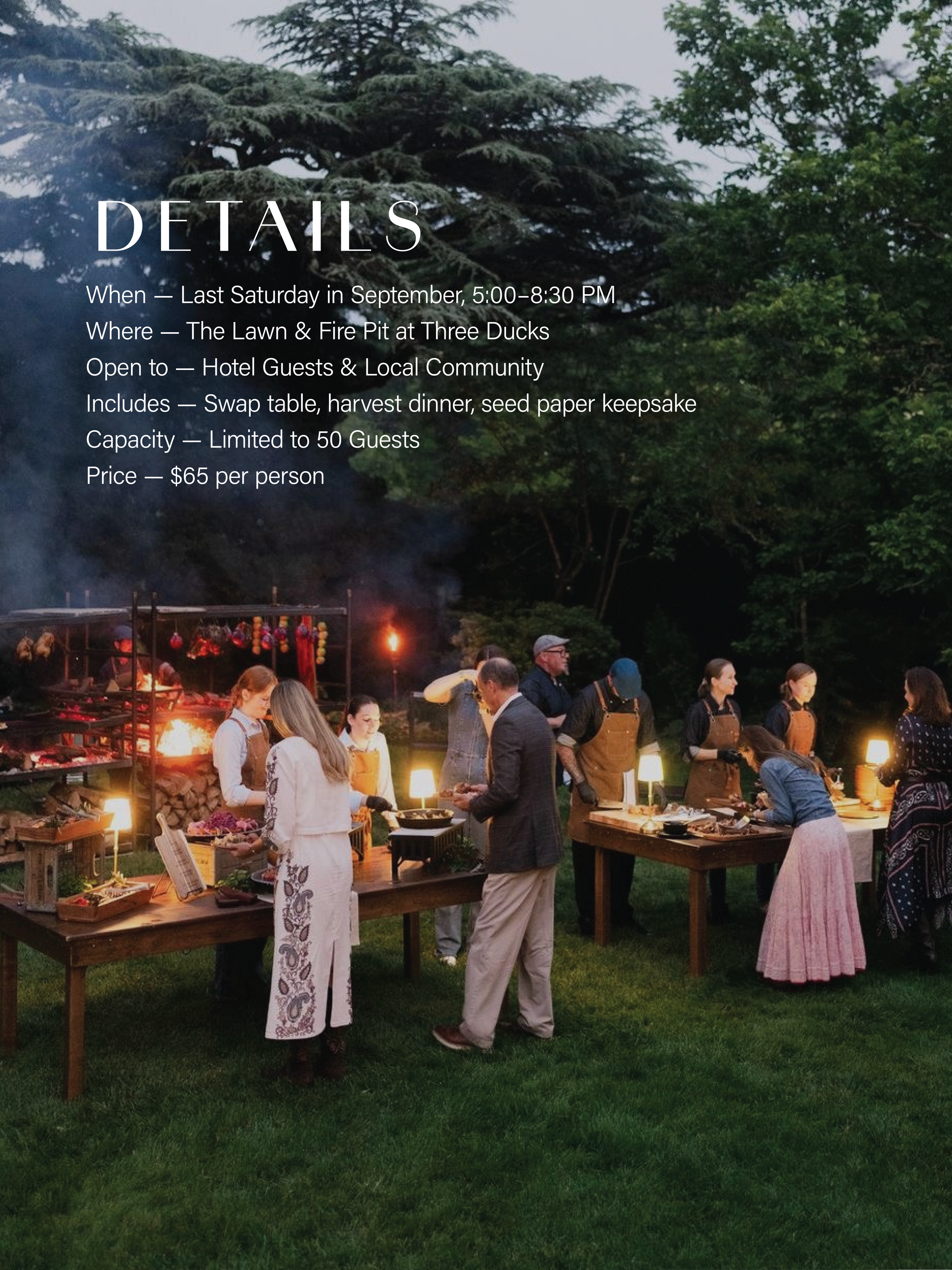
This concept extends Three Ducks’ identity as a Hamptons lifestyle brand centered around nature, community, and seasonal experiences into a full event built around migration itself. The evening unfolds in three parts, a subtle nod to the Three Ducks brand name, that mirror what ducks naturally do before migrating: guests lighten their load at a swap table, gather around the fire for a harvest dinner sourced from a local farm stand, and close the night by writing a wish on a piece of seed paper to take home and plant in spring. Drawing inspiration from the Three Ducks brand, the concepts of flock, harvest, and migration symbolize gathering, abundance, and moving into what’s next. The goal was a concept that feels native to the brand’s events around nature and community, designed to feel like a natural extension of that same world.